“The colour palette reinforces Wovyn’s connection between technology and humanity: a cool, technical blue represents the digital intelligence behind the product, while a warm orange introduces a more human, emotional dimension. Together, they create a visual balance between machine and memory, innovation and intimacy.”
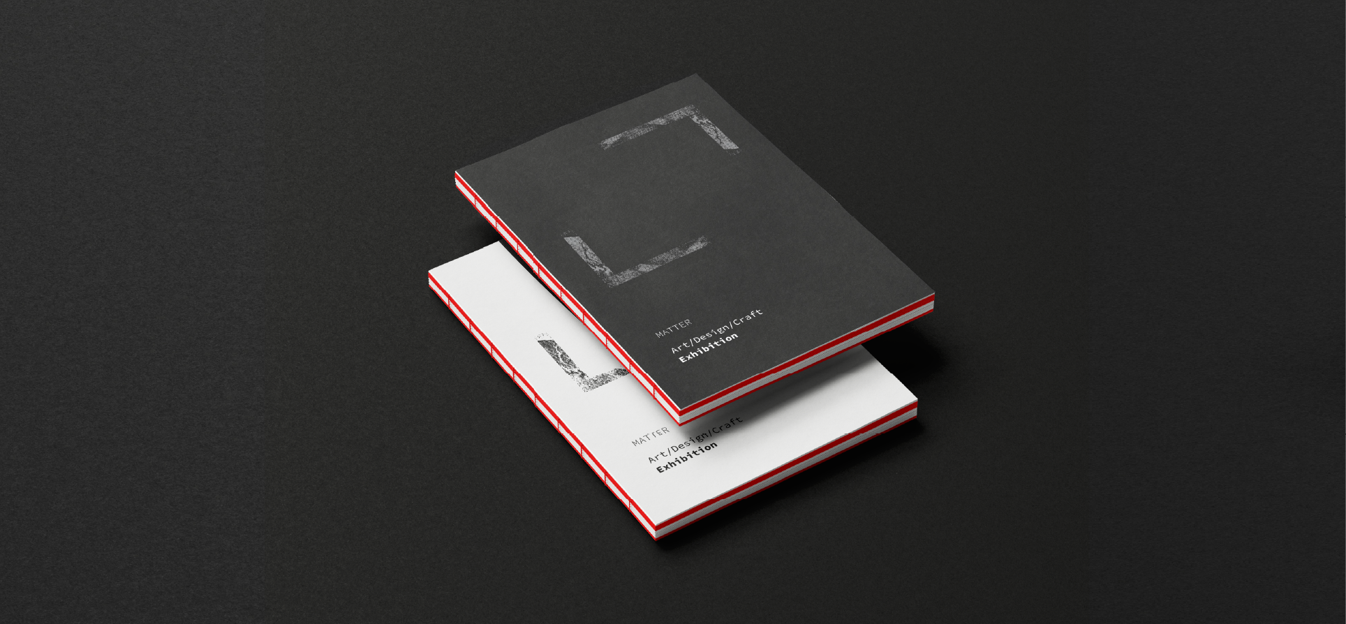
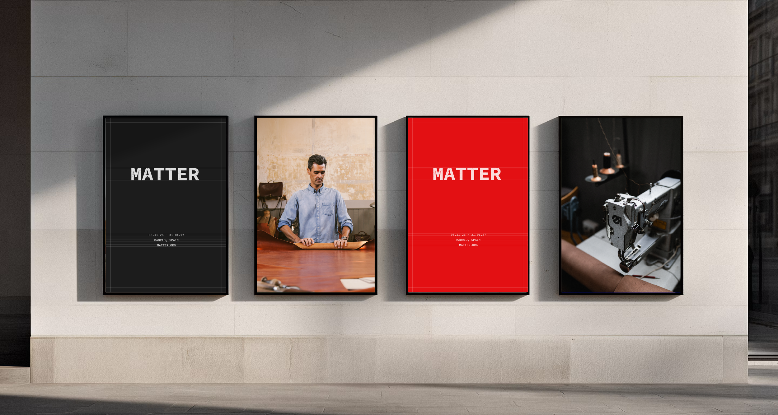
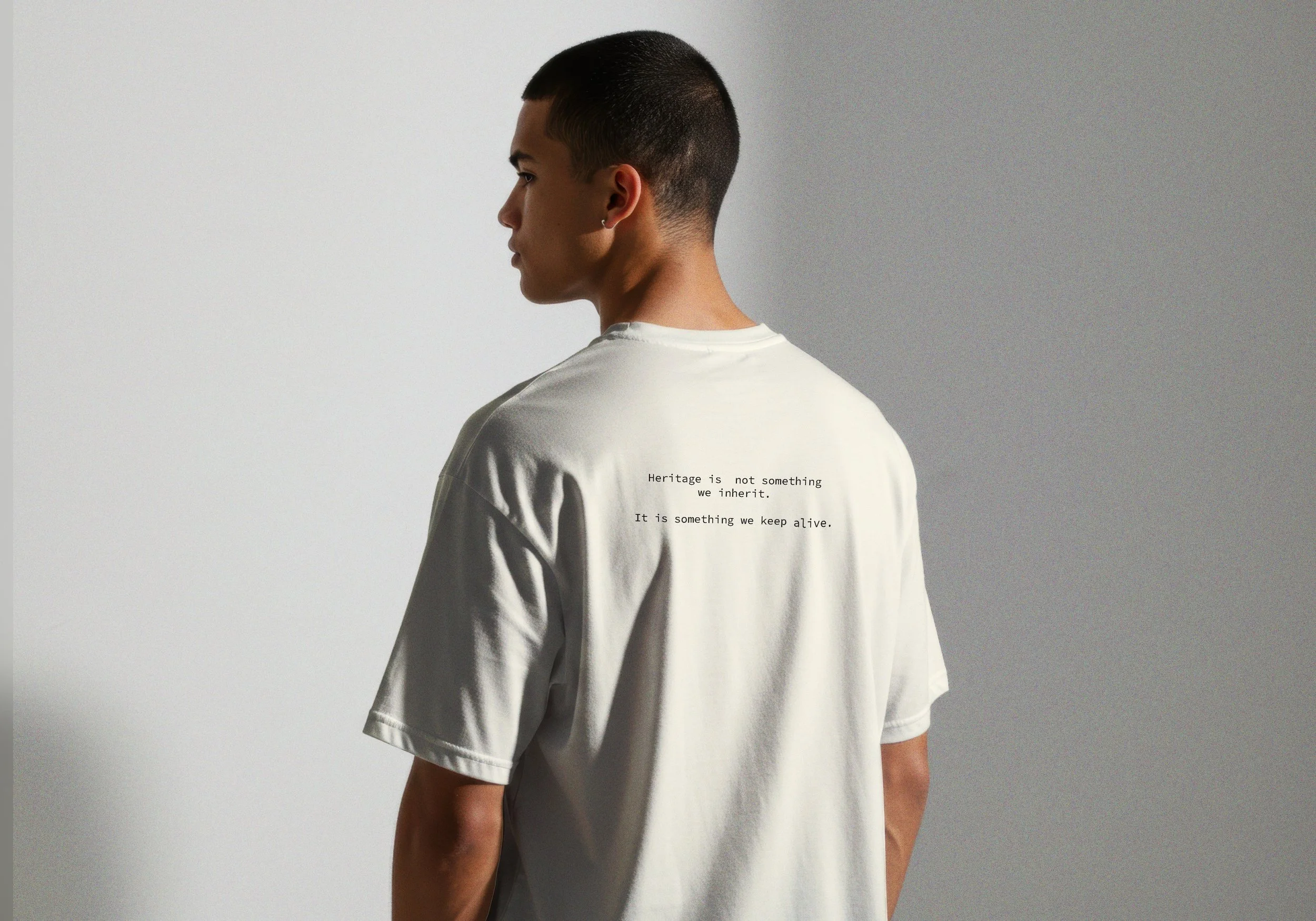
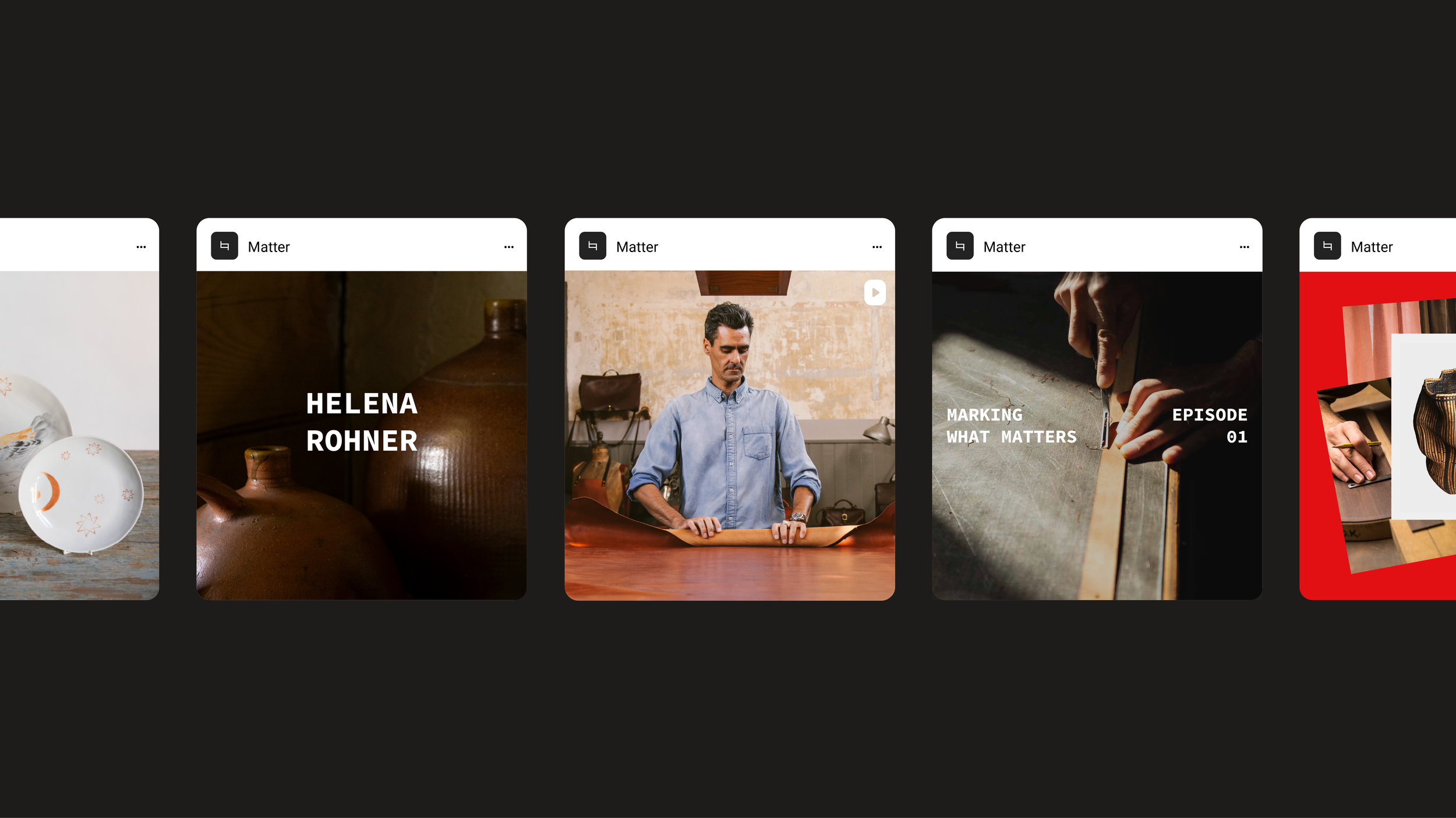
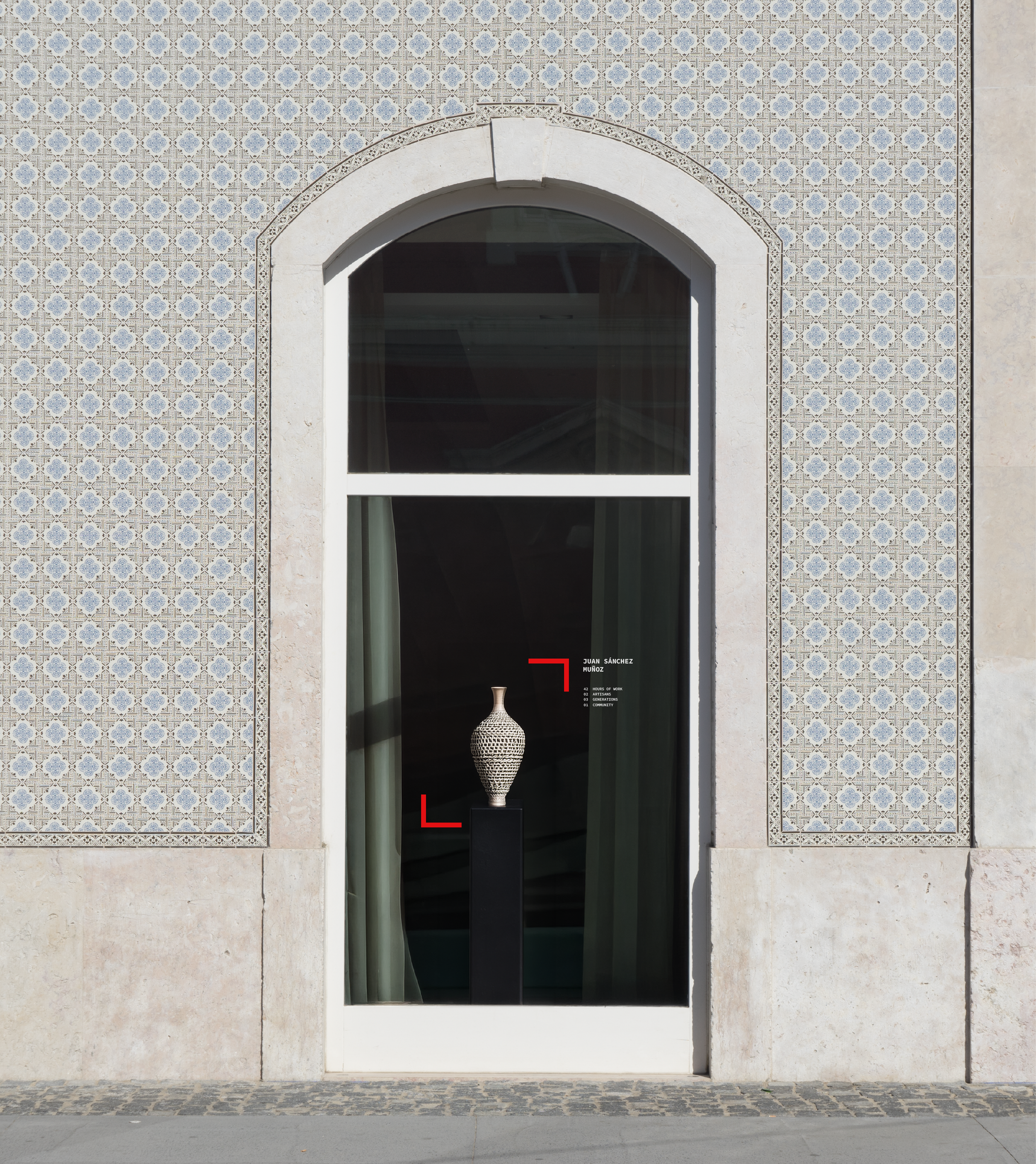
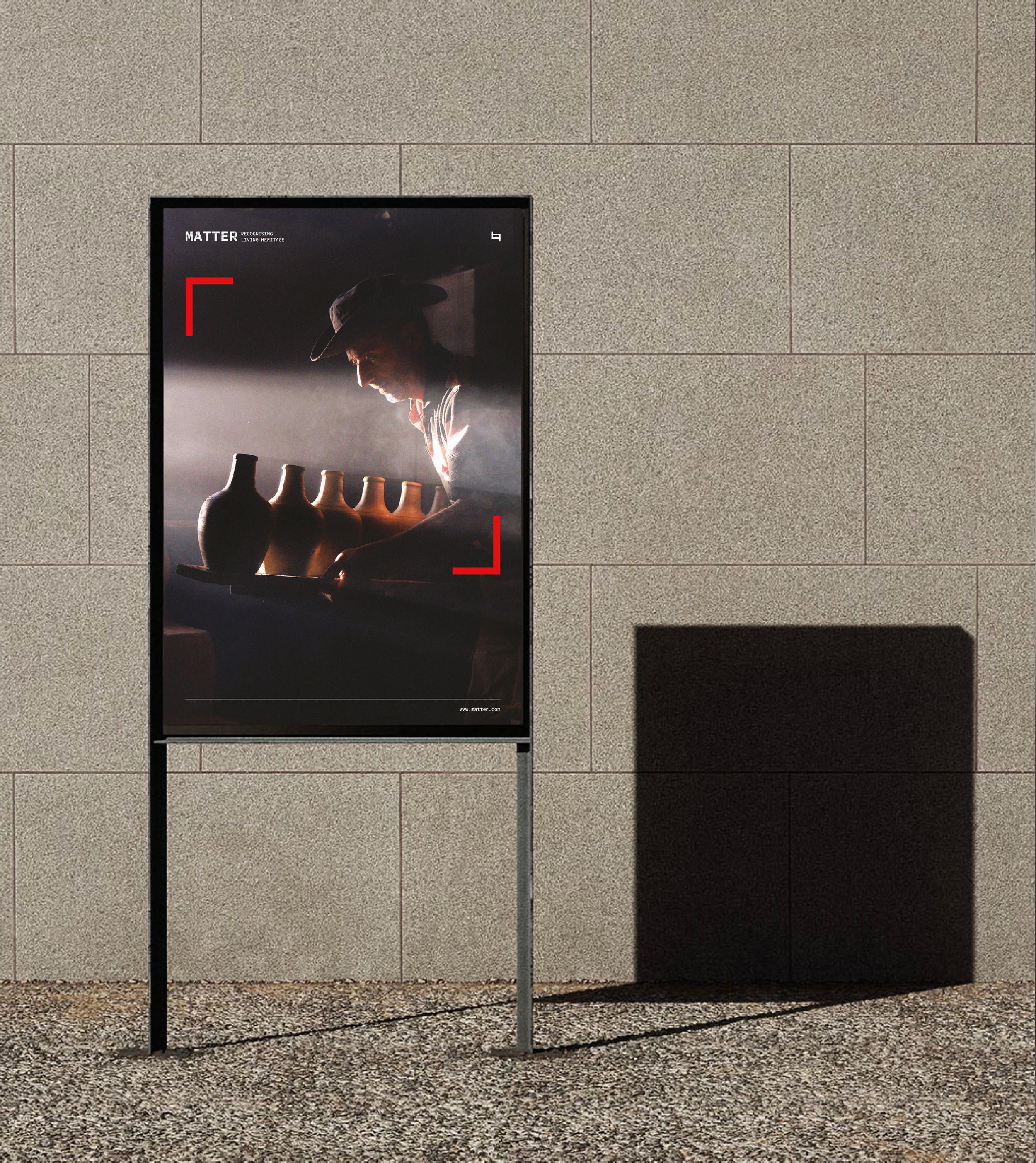
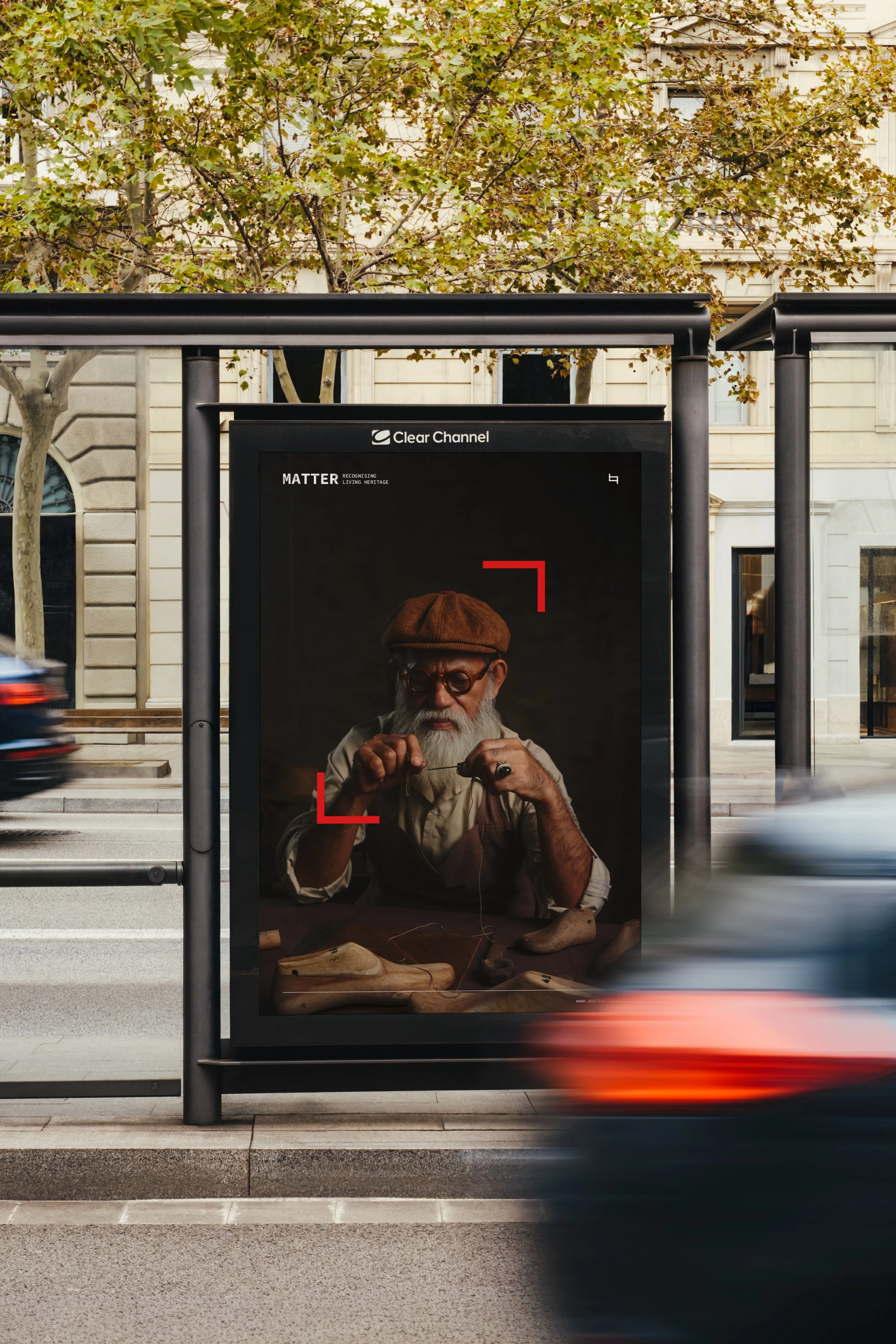
“MATTER explores the relationship between materiality, form and perception, transforming everyday elements into a visual language. Through a minimalist yet expressive approach, the project highlights the beauty of textures, contrasts and details, inviting us to look beyond the surface and reconsider the objects that surround us.”
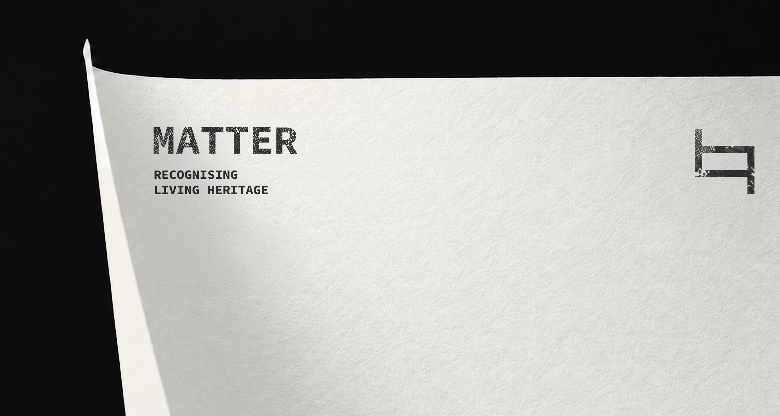
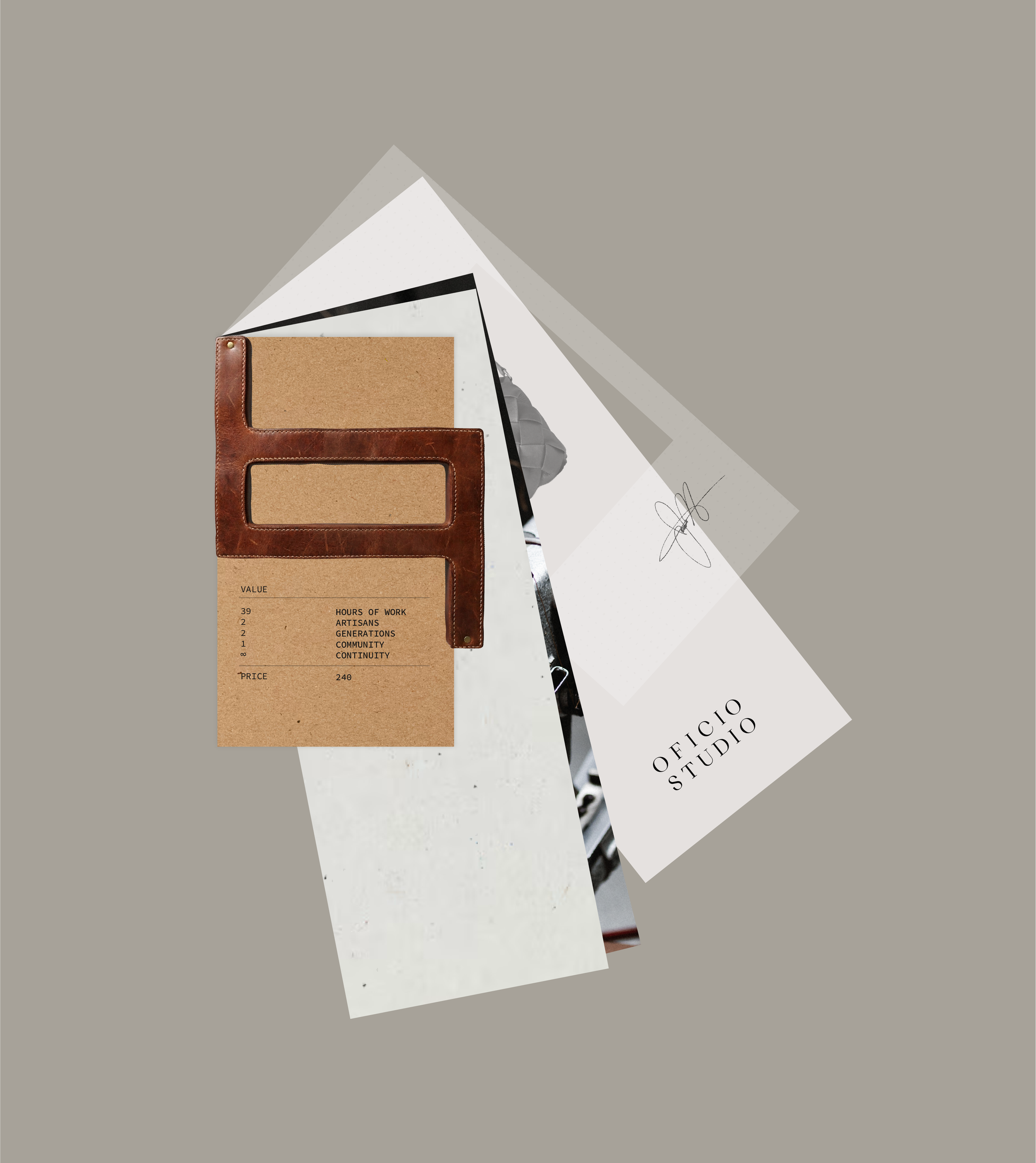
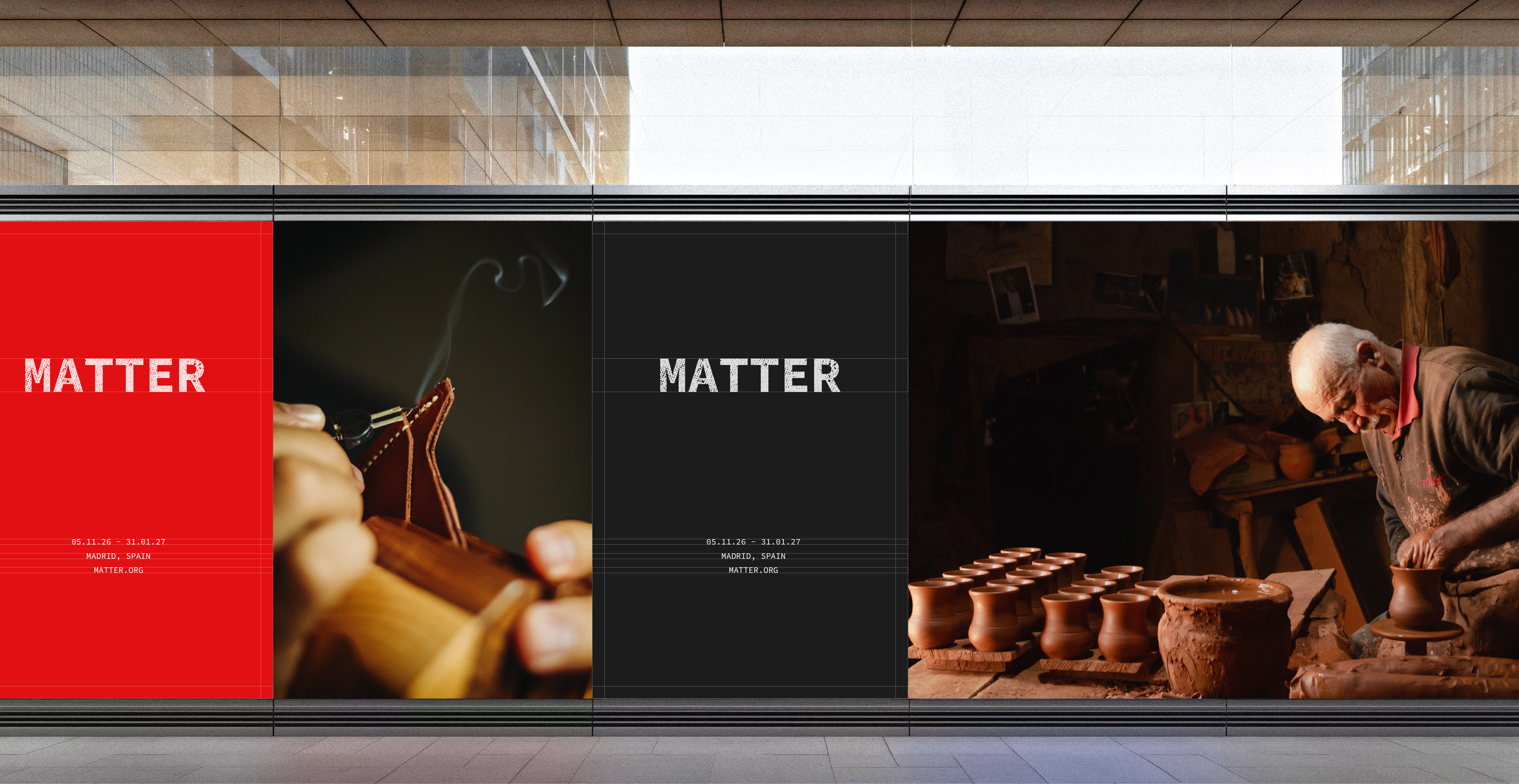
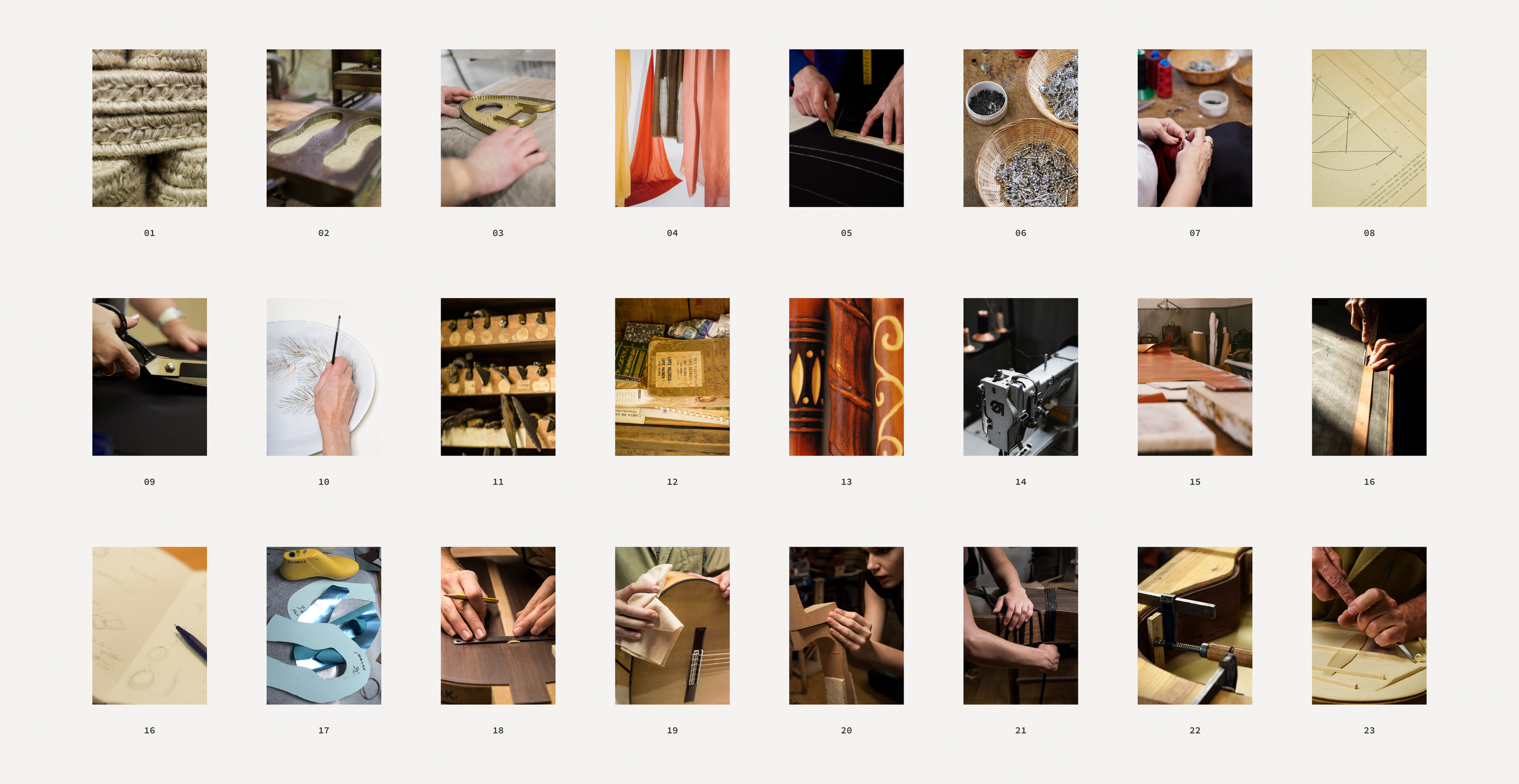
“The project began with a visual and auditory exploration of artisan workshops across Spain, from bookbinders and luthiers to ceramicists and traditional cape makers. Through their tools, materials, sounds and processes, I explored the essence of craftsmanship, laying the foundations for the project's visual direction.”
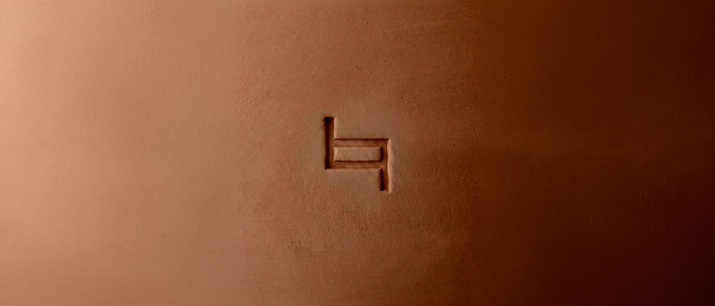
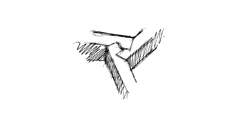
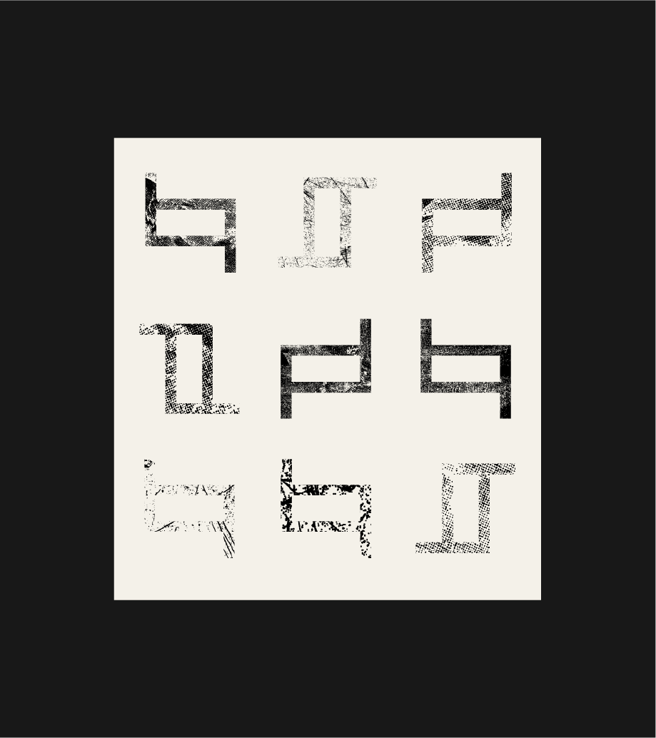
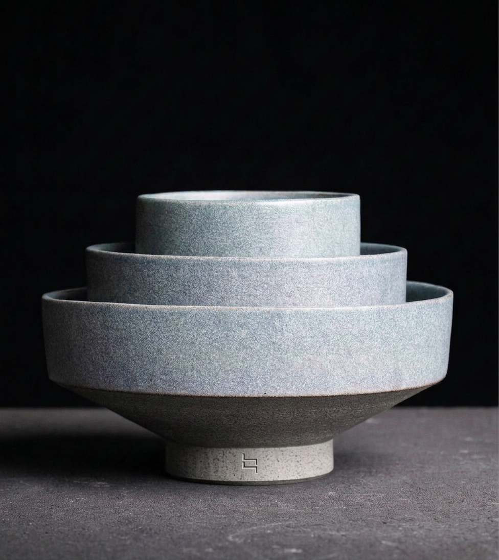
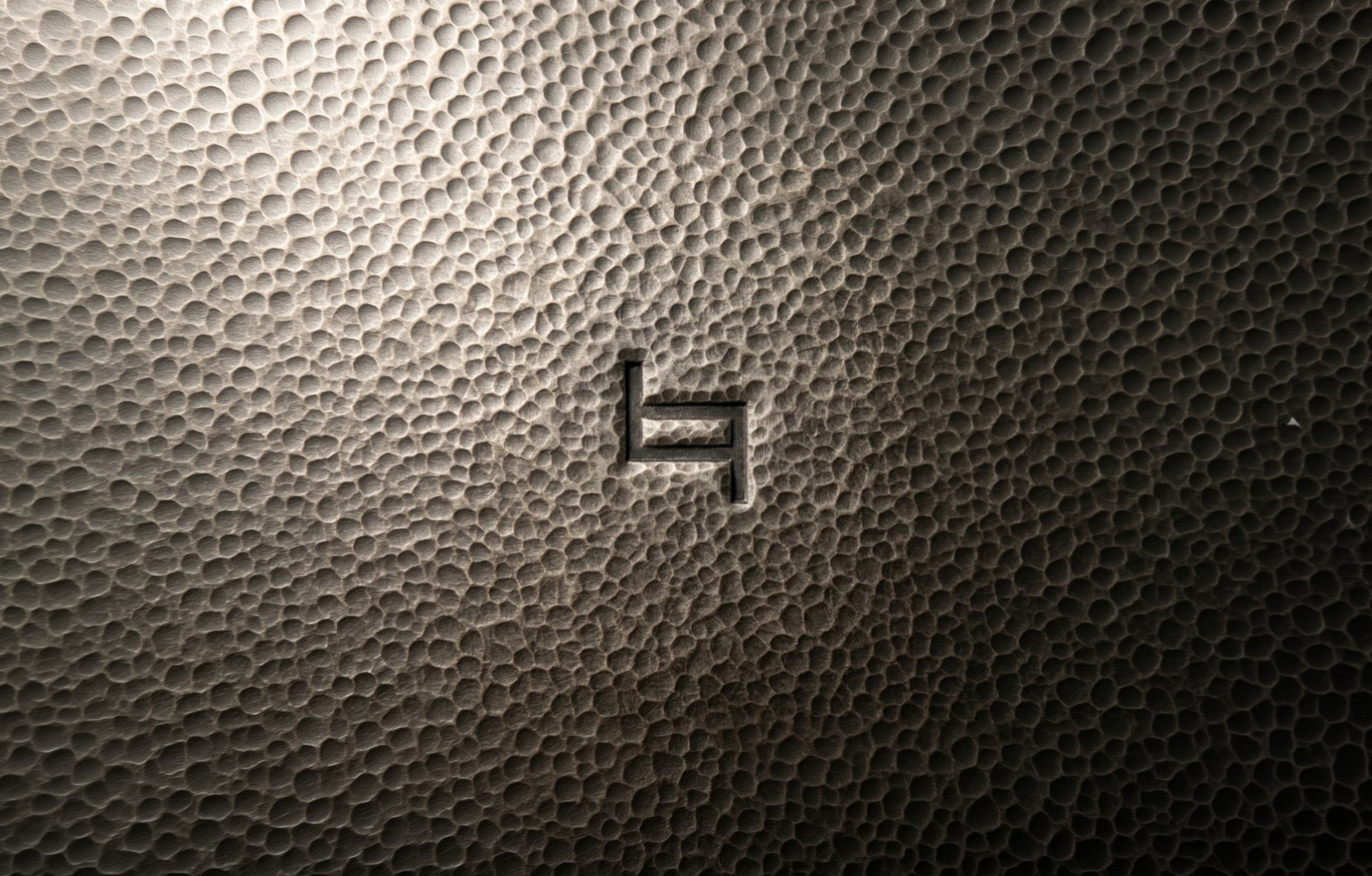
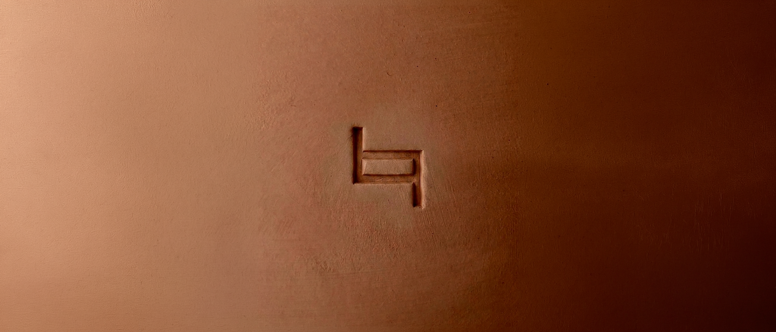
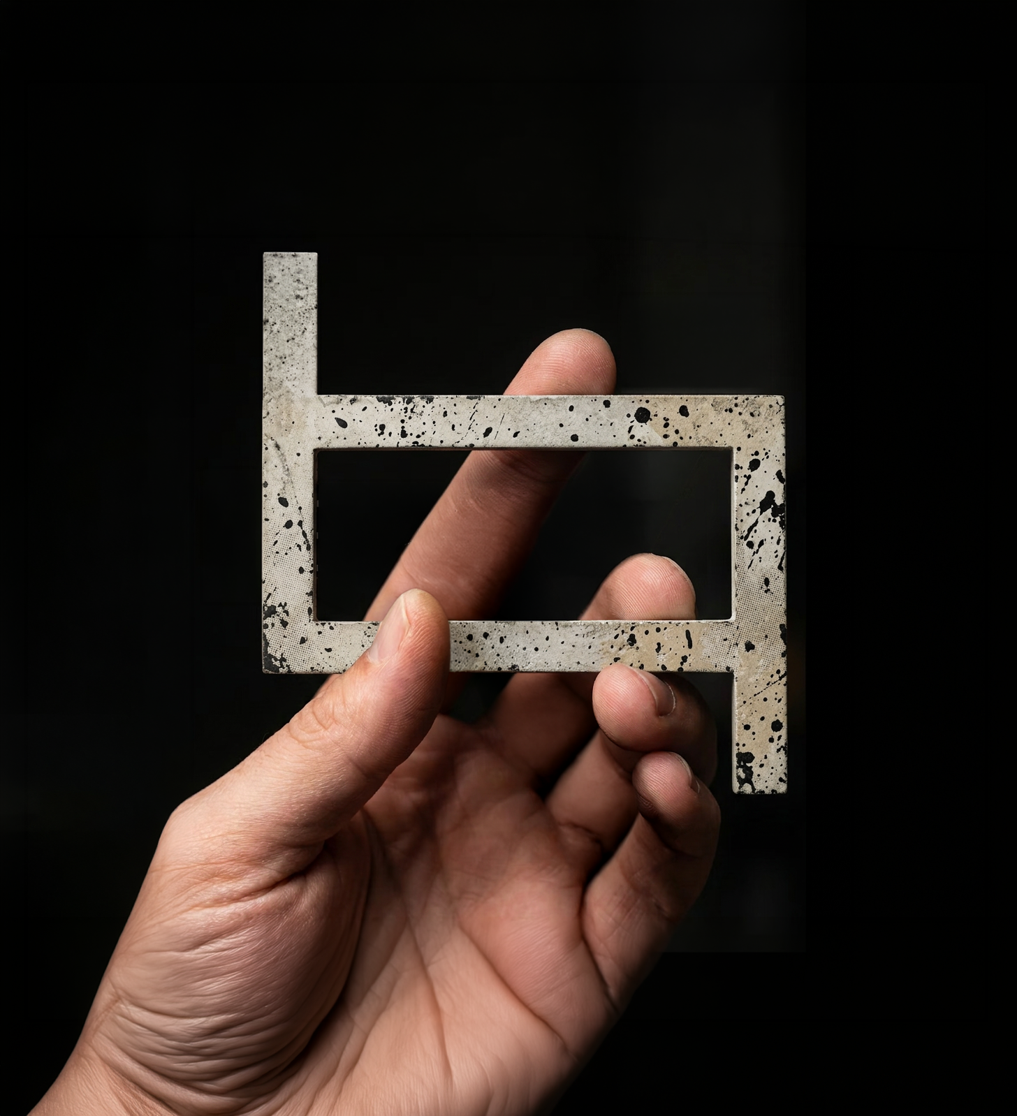
“Inspired by the name, the symbol brings together two opposing “T”s to create a unique focus mark. A lens-like shape that invites us to look closer, shift perspective and see what truly matters.”